Clarifying UX Language: How Libry Boosted Engagement by Replacing "Added" with "Subscribed"

Libry · 2025

Clarifying UX Language: How Libry Boosted Engagement by Replacing "Added" with "Subscribed"

UXResearchCopywriting
1 word
Changed
3 methods
Of user research
↑ KPIs
Engagement aligned

Overview

A simple word change made a big difference. See how user research led to Libry replacing the unclear term "Added" with "Subscribed" — resulting in better UX clarity, stronger engagement, and improved alignment with product KPIs.

Outcome

Replacing "Added" with "Subscribed" reduced user confusion, improved interface clarity, and better aligned the product with user behaviour and Libry's KPIs — proving that the right word in the right place is a product decision, not just a copy choice.

About Libry

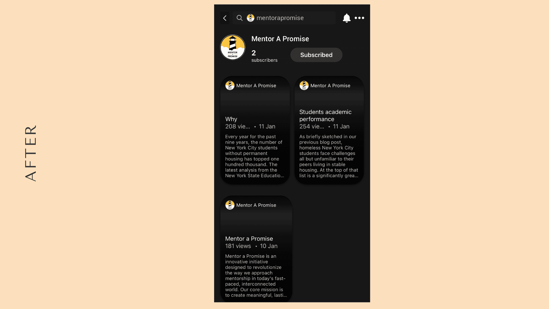
Libry is a platform for content creators to display their serious work. To stand out, Libry originally used "Added" as their version of "Subscribed" inspired by ideas of adding value and growing a creative network. But early users were confused by the non-standard term, creating friction at the most critical point of user interaction: the moment someone chooses to follow a creator.

The Challenge

01

Libry's original use of "Added" aimed to be unique, but users repeatedly asked what it meant during early feedback sessions and surveys.

02

The disconnect between internal branding intent and user expectations was silently hurting engagement — without anyone fully realising why.

03

Friction at this specific micro-interaction was suppressing the core action Libry needed users to take: subscribing to creators.

04

The fix needed to be validated through real user data, not assumptions — requiring a structured research approach before any change was made.

How We Helped

User Research Across Three Channels

Ran a survey targeting early testers for broad insights, 30-minute individual feedback sessions for deeper context, and collected user votes via Canny.io all pointing to the same pain point.

Terminology Change to "Subscribed"

Recommended changing "Added" to "Subscribed" a more recognisable, action-oriented term that aligned with user mental models and reduced cognitive friction instantly.

UI Restructure to Support the Shift

Made the subscriber count more visually prominent, increased the visibility of the bright green "Subscribe" button, and reduced emphasis on passive data to drive active engagement.

KPI Alignment

Restructured the surrounding interface to directly support Libry's business KPIs ensuring that design, language, and user behaviour were working in the same direction.

The Outcome

Reduced User Confusion

Feedback sessions after the change showed users immediately understood the "Subscribe" action — eliminating the most common point of confusion on creator profiles.

Improved Interface Clarity

The surrounding UI changes made the subscription action more visually prominent, increasing the likelihood of users taking the intended action.

Better Product Perception

Clear language builds trust. When design and language work together, engagement grows naturally — and Libry's interface felt more professional and intuitive as a result.

Validated Research Process

The project established a repeatable user research framework — surveys, sessions, and Canny — that Libry now uses to validate future UX decisions.

Have a growth challenge of your own?

Let's Build Your Success Story

hello@tierra.dev →