Rethinking Navigation For Focus & Flow

OpenBlend · 2025

Rethinking Navigation For Focus & Flow

UXNavigationEnterprise
14+
Links consolidated
0
Portal detours
↑ Focus
Role-based UX

Overview

A behind-the-scenes look at how thoughtful UX decisions transformed OpenBlend's navigation from cluttered menus to a streamlined, role-based sidebar that improves focus and reduces friction.

Outcome

The updated sidebar system became the new product standard — reducing steps, minimising confusion, and increasing user confidence across the platform.

About OpenBlend

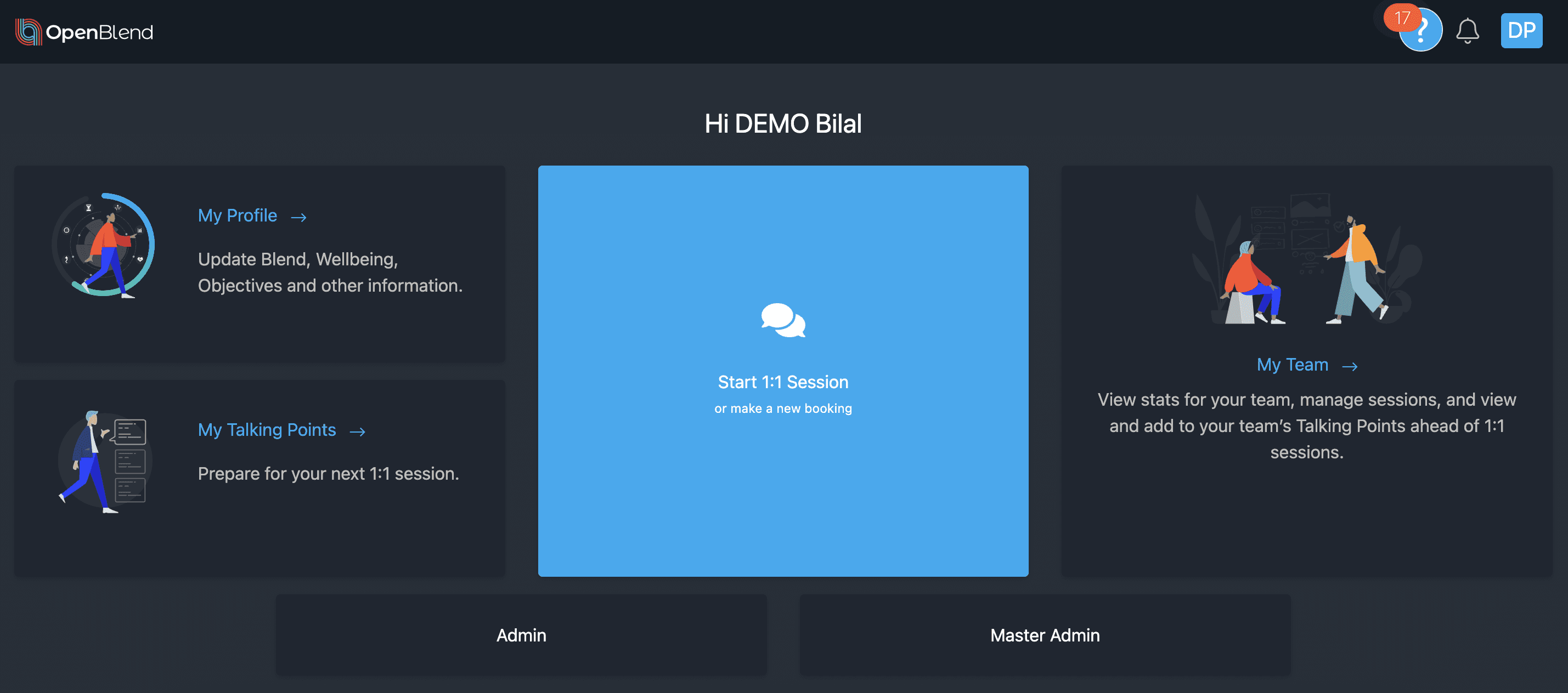
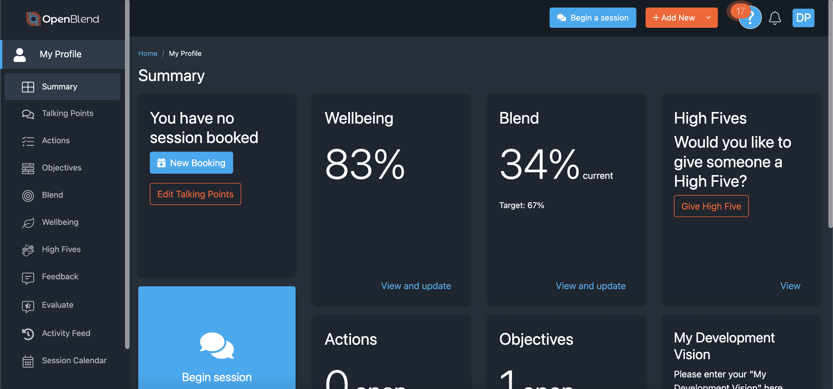
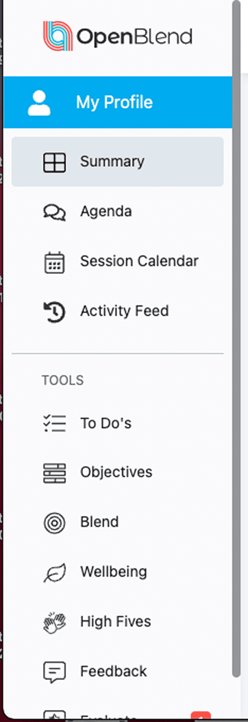
OpenBlend is an enterprise platform where users regularly switch between roles admin, manager, employee to complete different tasks. In earlier versions, each role lived in a separate portal, meaning users had to backtrack through an entrance portal just to change view. On top of that, 14+ items were always visible in the left-hand menu with no hierarchy, making it hard to find anything at a glance.

The Challenge

01

Users had to navigate to a separate entrance portal to switch between roles (admin, manager, employee) — adding multiple clicks and page loads to every role transition.

02

Over 14 items were always visible in the left-hand menu with no hierarchy, making it difficult to find what was needed at a glance.

03

The cluttered layout caused cognitive overload, slowing users down and reducing confidence in the platform.

04

The design lacked the clarity expected of a mature enterprise product — making navigation a friction point rather than a foundation for productivity.

How We Helped

Hierarchy & Prioritisation

Introduced clear visual hierarchy by placing key items at the top and separating tools into a clearly labelled section making the most-used actions immediately accessible.

Streamlined Menu

Prioritised what users interacted with most often, minimised cognitive overload, and removed rarely-used items from the primary navigation a meaningful reduction in visual noise.

Persistent Role-Based Sidebar

Replaced the entrance portal with a persistent sidebar allowing users to seamlessly switch between views Me, My Team, Admin without leaving their current context. Inspired by familiar enterprise tools like Microsoft Teams.

Iterative Usability Testing

Each update was usability-tested and iterated based on real feedback, across two major design iterations ensuring the changes worked in practice, not just on paper.

The Outcome

Seamless Role Switching

Users can now move between key roles instantly without portal detours — saving time and removing one of the platform's most consistent friction points.

Reduced Cognitive Load

Clear hierarchy and label clarity mean users spend less mental energy navigating and more time doing their actual work.

New Product Standard

The updated sidebar system became the default interaction model for OpenBlend — a signal of product maturity and successful interface optimisation.

User Confidence Increased

"The new sidebar has completely transformed how we manage our daily tasks. It really feels like the design was built around how we work, not the other way around." — OpenBlend Team

Have a growth challenge of your own?

Let's Build Your Success Story

hello@tierra.dev →